

Pantone has named the color of the year for 2015, Marsala
#BlogArticles
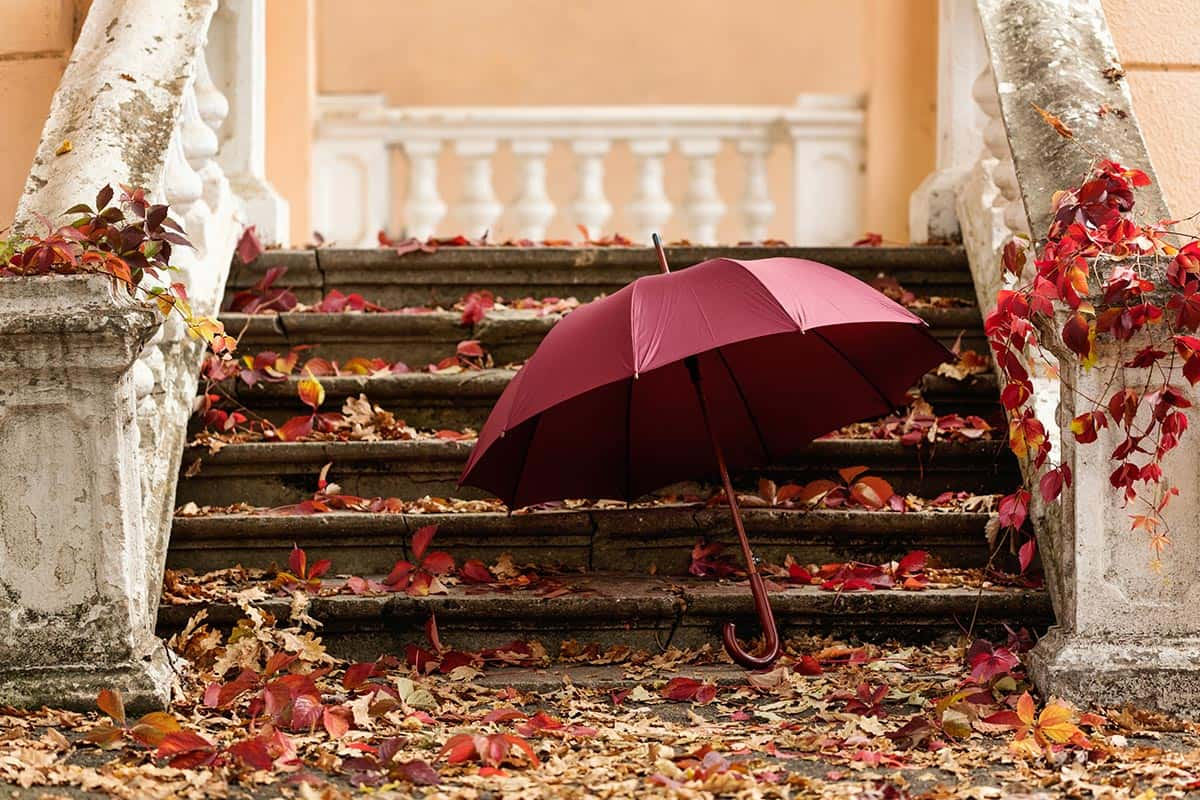
Marsala, Pantone 18-1438 has been named Pantone’s color of the year for 2015
Every year graphic designers, fashion designers and artists alike around the globe anticipate the announcement of next years color. Pantone has describe the color as “a naturally robust and earthy red wine” – Leatrice Eiseman, executive director of the Pantone Colour Institute.
Pantone discusses its use in graphic design as a rich contrasting color, ideal for use in graphic design and packaging. They state that it is eye-catching but not overwhelming, and great for point of purchase design, packaging or stationary.
But is everyone loving the color?
Apparently not.
The Atlantic, in their post “The problem with pantone’s colour of the year” has referenced the color to rust, the kind that lines frat boy dormitory style bathrooms, or dried blood. Yikes – it clearly isn’t having everyone run out to paint their walls this colour. The magazine further compared its color to that of liver or meatloaf.
So what does our team at SOS Media Corp think?
“I really like it, it’s really pretty and a great holiday color. It’s not too bright and very natural” – Amanda, Junior Graphic Designer
“For me it has a very vintage, mature feel, and would work well for post modern style designs accented with pastels or natural colors. ” – Kerri, Graphic Designer
So despite it’s criticism, it seems the team at SOS likes it!