Interactive, Responsive and Reactive – What’s the difference?
#BlogArticles
If you work alongside web developers and designers or find yourself in the market for a new website, chances are that you’ve heard buzzwords such as “reactive”, “interactive”, and “responsive” used to describe features on modern websites. While all three words are related in everyday English, each term means something vastly different within the context of web design.
Why might a web developer charge extra for reactive, interactive, and responsive features?
If a template is responsive, does that mean it’s also reactive or interactive?
Interactive Web Design
When you hover over this sentence, it changes color. However, I bet that before you started reading this paragraph, you’d already glanced at these words right here since they were blinking this whole time (and will only stop if you hover over them).

Each one of these effects was triggered in response to an action that you, the user, took. In other words, interactive features rely on the user’s interaction with the device in order to provide visual feedback, guide the user, or illicit an emotional response (more on this here).
Interactive elements are everywhere and they play a key part in making sure that users have a positive and stress-free experience on your website.
In fact, the most effective interactive elements and animations are subtle and not really noticed at all.
A website where you have to wait for every paragraph to bounce or twirl onto the screen before you can continue reading is more likely to be perceived as annoying or distracting rather than “cool”. Good web designers know how to add interactive elements to a site.
Great web designers are purposeful in adding interactive elements. With an understanding of basic human psychology (especially in areas such as attention/focus and emotion), a web designer can use interactive elements to turn a boring corporate brochure website into a friendly and helpful experience. Being purposeful could mean the difference between building user-friendly websites and tossing a few interactive elements on a page for some extra flair.
For more information on creating purposeful UI animations, you should check out Val Head’s streamcast, “All The Right Moves“.
Responsive Web Design
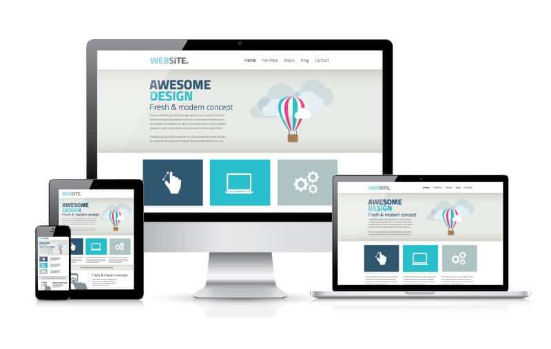
Responsive Web Design is perhaps the most important concept that you should familiarize yourself with. With the rise of tablets and smart phones over the last 10 years, you can access the internet from anywhere and view websites on a range of different screen sizes.

Web designers have to account for this by planning how the website will look on screens as small as an iPhone 4 and as large as a widescreen computer monitor. No matter how the browser window is resized or which device is being used, the website still needs to adapt so it can look just as good as it did on the designer’s desktop monitor.
With the rise of smartphones in the late 2000’s, many different words were thrown around to describe website templates that adapted to the size of their browser window. Designers used terms such as “fluid”, “liquid”, “flexible”, and “elastic”. It wasn’t until 2010 that an article was published by Ethan Marcotte that popularized the term “responsive”. By 2014, the number of users on mobile devices outnumbered users on desktop computers and building responsive web templates was no longer an option, but a necessity.
So, what does building a responsive website entail? Besides resizing and readjusting the main content so that it remains uncluttered and easily readable on a small screen, designers need to consider how the page menu will be accessed when there’s not enough room on the screen to list every link. Clickable icons and hyperlinks need to be large enough that anyone with large hands can easily select them on a smart phone without triggering a different element on the screen. Pages can’t be too long or mobile users may spend a ridiculous amount of time trying to scroll down (or back up to the top) which could potentially cause them to get bored or frustrated and leave the website. Interactive elements that rely on using a computer mouse to “hover” and trigger an effect may not work as intended from a touch screen (such as the animations I put in the “Interactive” section of this post).
…and that’s just the tip of the iceberg!
One of the ways designers perform responsive template wizardry is through the use of “media queries”. The media queries check things such as how big the browser window is and then apply different styling depending on what the designer wants for certain window sizes.
Reactive Web Design
Over the last couple of years, you may have noticed how websites such as Facebook no longer require you to refresh the page in order to update and view the number of unread notifications for your account. Instead, the number automatically updates, sometimes with a sound or animation to notify you.
Reactive features are constantly checking a website’s server for changes.
As soon as a reactive element detects a change in the information being stored on the server, it sends a signal to your browser window to make the update to just that one section of the page so you can view the change as it happens without having to reload everything. Most elements on a website check the server only one time: when the page is loaded.
Nowadays, reactive programming is everywhere. Google Docs is a perfect example of reactive programming since multiple people can edit the same document from different computers at the same time and the changes are instantly registered and displayed on all screens.
Summary
- Responsive: adapting layouts to a variety of screen and window sizes.
- Interactive: elements that react to your actions on the site.
- Reactive: automatically checking and updating data from the server without refreshing the website.

